MS Research — Charity website redesign
Role: UI Designer (Competitive analysis, style guide, prototyping)
Duration: 1 week
Team: Solo project
Deliverables: High-fidelity responsive prototype
Tools: Figma, Zoom, Slack
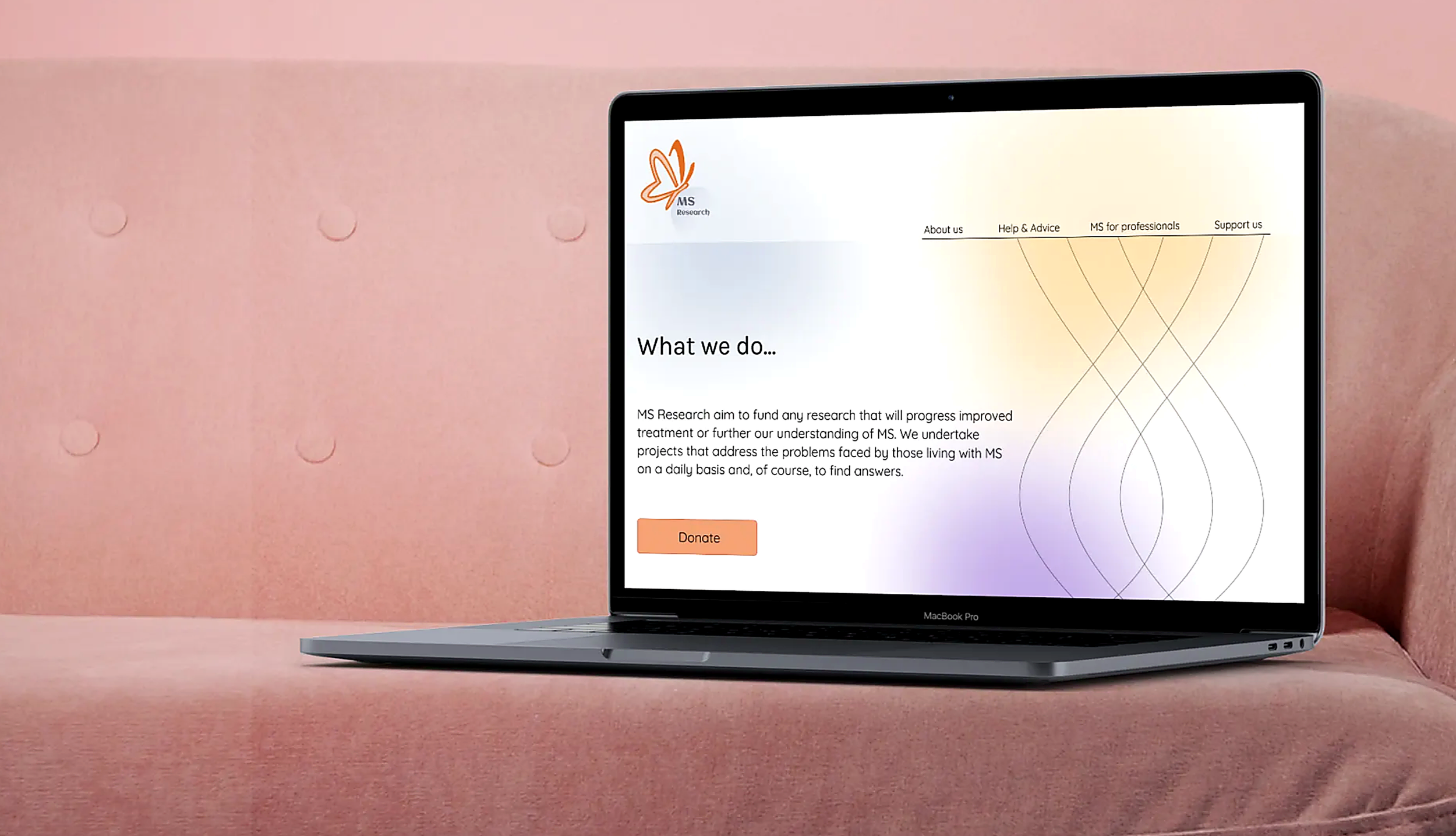
A conceptual UI redesign of MS Research's homepage, built to feel warmer and more welcoming to everyday visitors while keeping the brand's scientific credibility intact.
The Challenge
MS Research's existing website felt outdated and lacked a strong visual language. A brand personality exercise revealed it read as complex, academic and literal rather than approachable. For a charity relying on public donations and everyday visitors looking to learn about MS, that distance was a problem: people didn't feel welcomed in, and the path to donating wasn't obvious.
The Solution
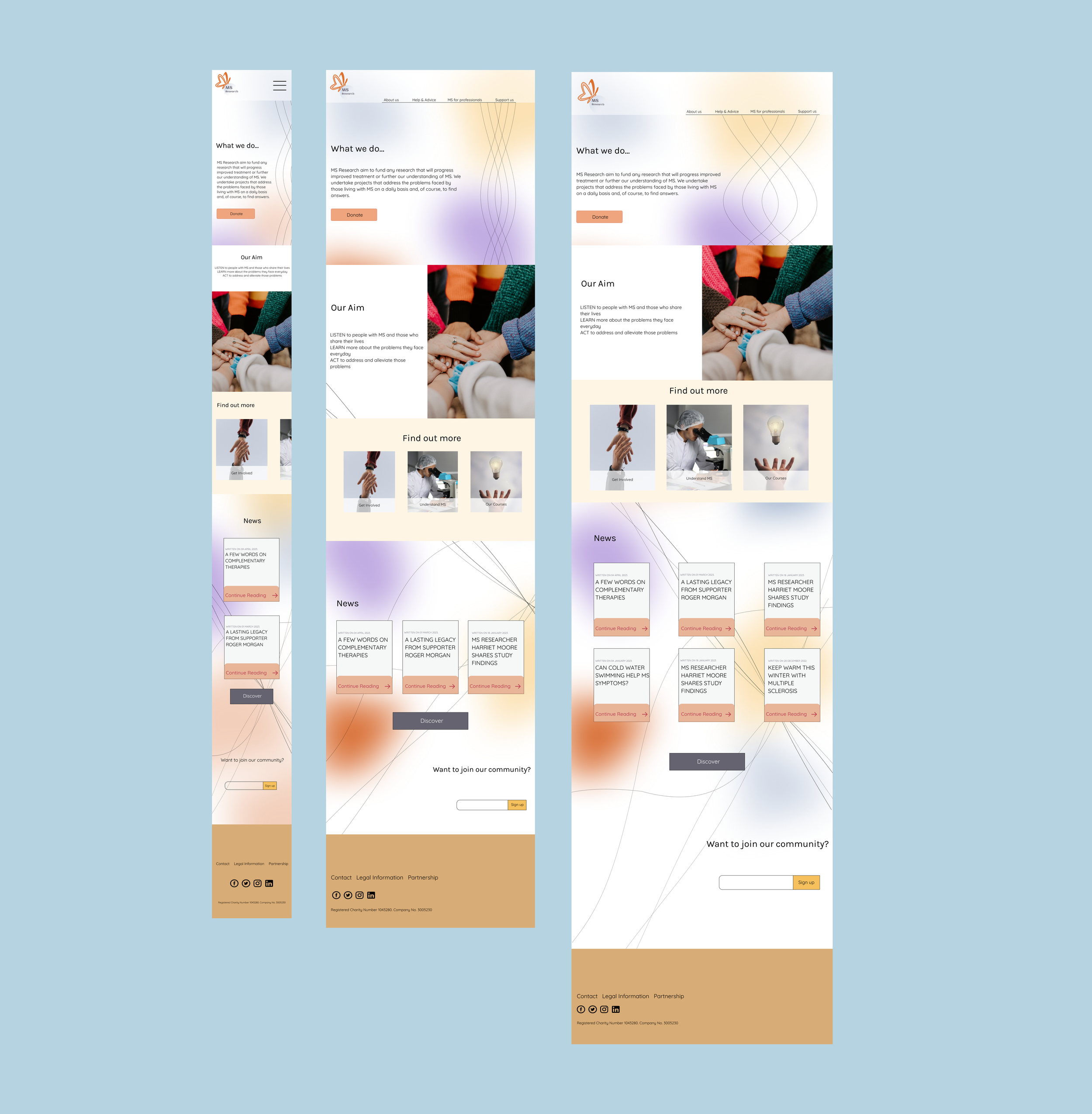
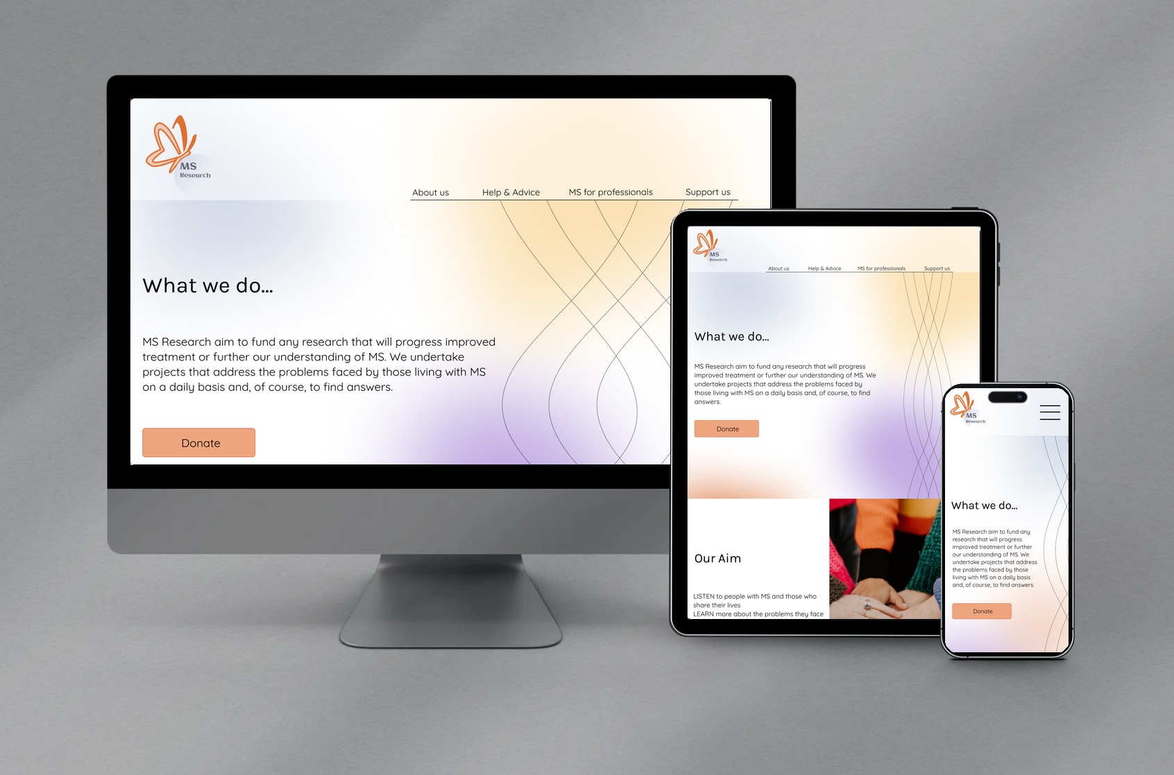
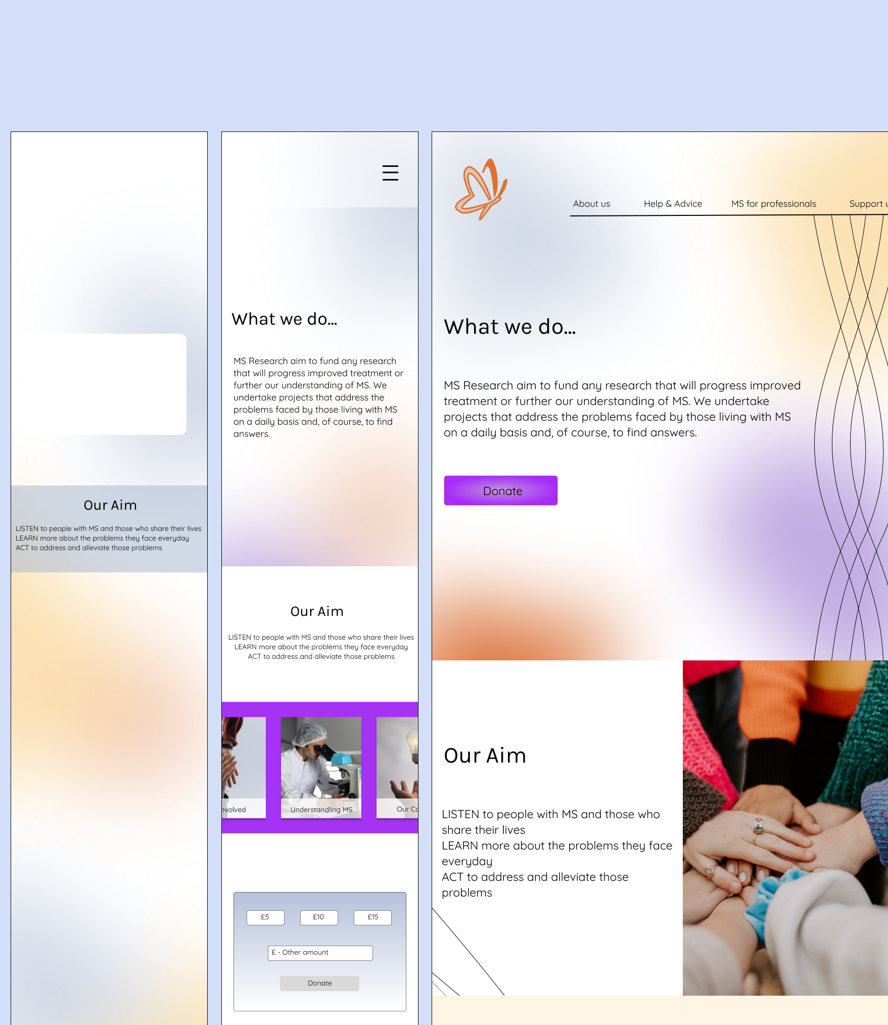
I redesigned the homepage around four brand keywords; flow, connection, open and optimistic, translating them into soft gradients, intertwining curved lines and a clear donate call-to-action, then built the design as a responsive prototype across desktop, tablet and mobile.
What I worked on
Brand & competitive analysis
Ran a brand personality exercise and benchmarked MS Society, MS Trust and Cancer Research UK to identify structural patterns and pain points
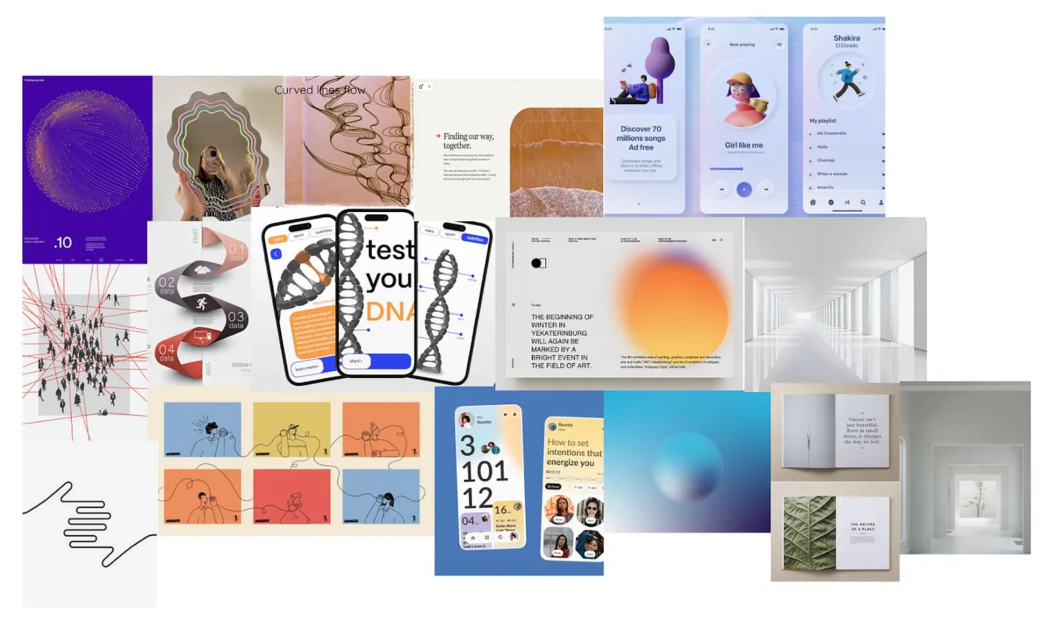
Mood boarding & style guide
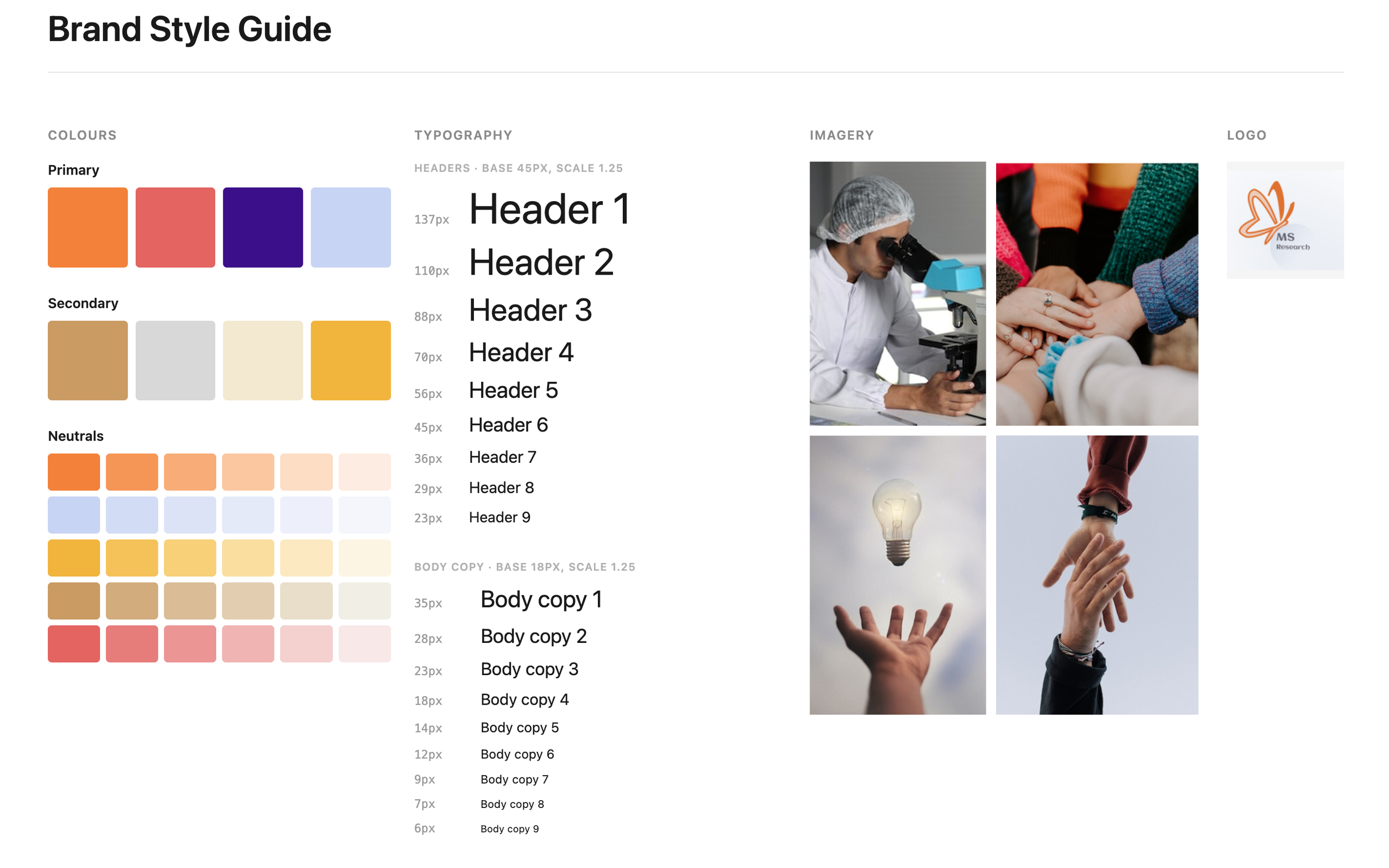
Built the site's visual language (colour palette, typography, imagery, iconography) around the keywords flow, connection, open, optimistic
UI design & prototyping
Designed and iterated a high-fidelity responsive homepage across breakpoints, from low-fi wireframes through to final prototype
Reflection
Comparing how the original site felt (complex, intimidating) against how I wanted it to feel (open, warm, optimistic) gave me a clear target to design towards. Looking at competitor sites also showed me something simple but important: all three had an obvious donate button on the homepage, while MS Research's original site left visitors unsure what to do next.
Sharing early drafts with peers and instructors paid off, their feedback consistently picked out the sense of flow and connection created by the line work and gradients, which told me the visual language was landing. My main takeaway was how much abstract brand words can shape concrete design decisions once you translate them properly, and in hindsight I'd spend more time validating that translation with real users, not just peer feedback.